So, how did I end up here?
Every designer is expected to have an origin story.
Preferably one involving an early obsession, a life-changing encounter, and a suspiciously prophetic sketchbook.
I could give you the official version. Years in design. Identities, websites, visual systems. A reasonably respectable sequence of events.
On paper, it looks like a career.
The director’s cut is less tidy.
Most projects don’t arrive as clear problems with a neat little brief attached. They arrive with something slightly off.
A company that looks like its competitors. A website that says all the right things and somehow says nothing. A good idea trapped in a form that clearly wasn’t built for it.
These things happen. Sometimes for years.
That’s the part I’m interested in: figuring out what a project actually needs to become unmistakably itself.
Not just better dressed. Although, occasionally, that helps.
Right. Where was I?
Ah, yes. Design.
I work with identities, websites, and visual systems. The visible part is the result. The more interesting part is figuring out what needs to happen before the result becomes obvious.
I tend to think in scenes. A change of perspective can do more than another layer of polish. And sometimes the most useful thing you can do for an idea is stop trying to make it behave.
Anyway.
The rest is easier to show than to explain.
What I actually do
I sometimes look at a project and wonder how it ended up looking the way it does.
Not because someone made a terrible mistake. Quite the opposite. Usually, a lot of reasonable decisions have been made along the way. Each one made sense at the time. Then one day you put everything together and discover that the result has very little to do with the thing you were trying to make in the first place.
The original brief rarely includes a checkbox for this.
I find these situations more interesting than the ones where the answer seems obvious.
There is usually a moment when the conversation changes. We stop talking about the logo, the homepage, or whether something should be bigger or smaller. We start looking at the project itself, at what it has become and what it might have been trying to say all along.
Sometimes the change is quite radical. Sometimes it turns out that most of the work is already there, just buried under a few decisions that nobody has thought to question.
I like that moment when things begin to fall into place, although they don’t always fall into place in the way anyone expected.
And I have a certain suspicion of solutions that arrive too quickly. Especially the beautiful ones. They can be very convincing, right up until you ask them to do something.
SELECTED
WORK / 03
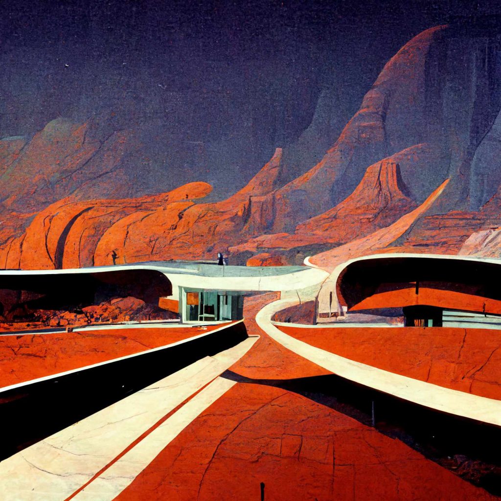
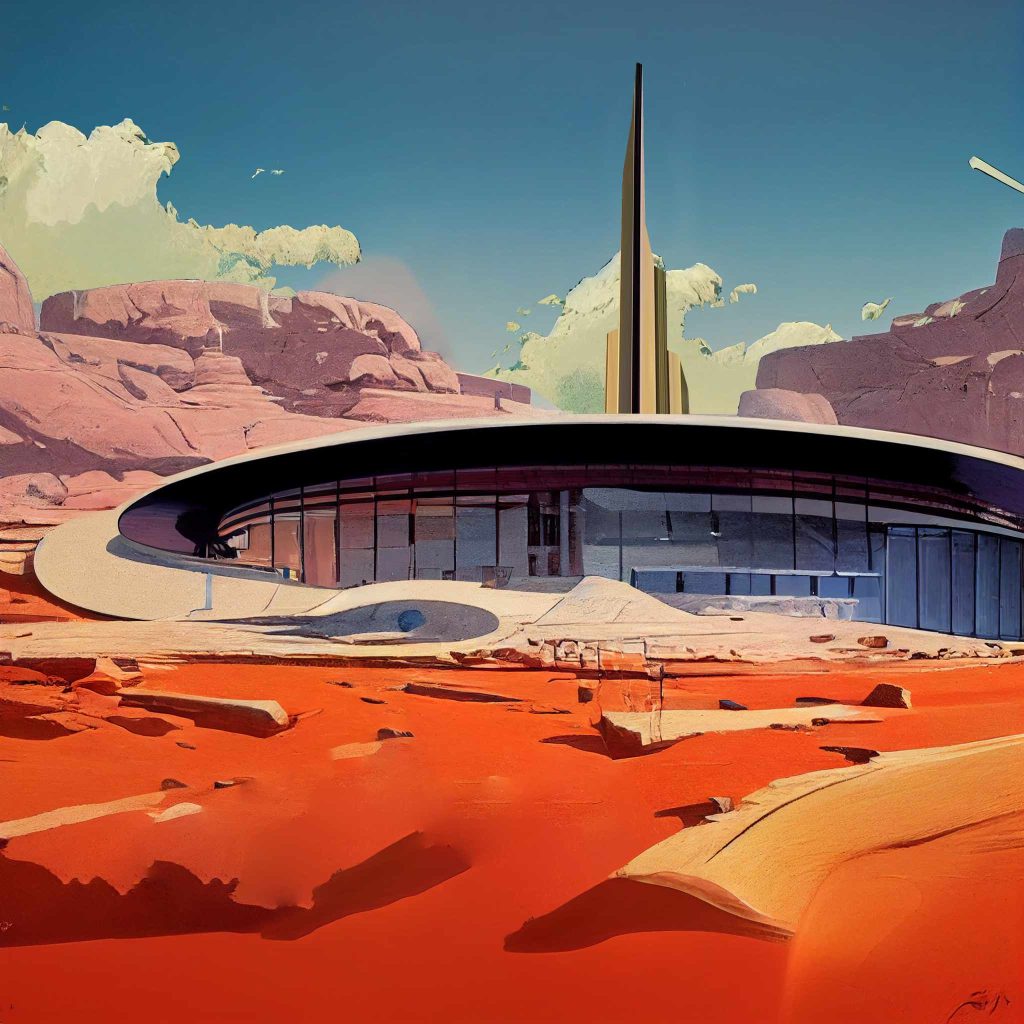
Ervandashat
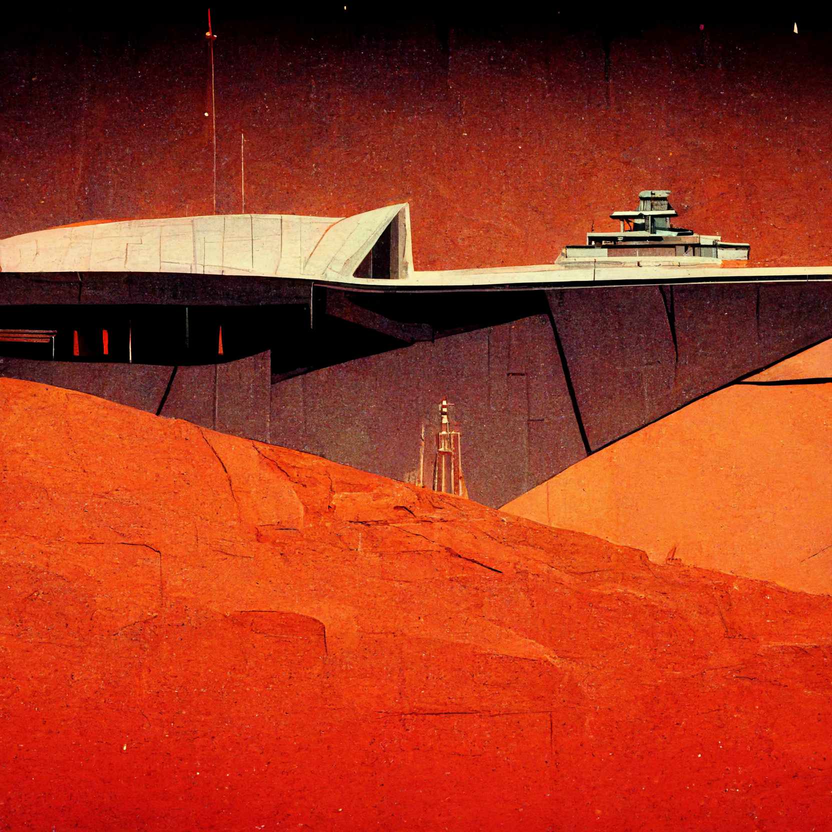
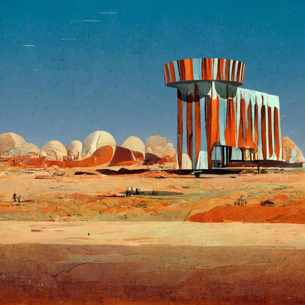
Conceptual Vision for a Future Territory
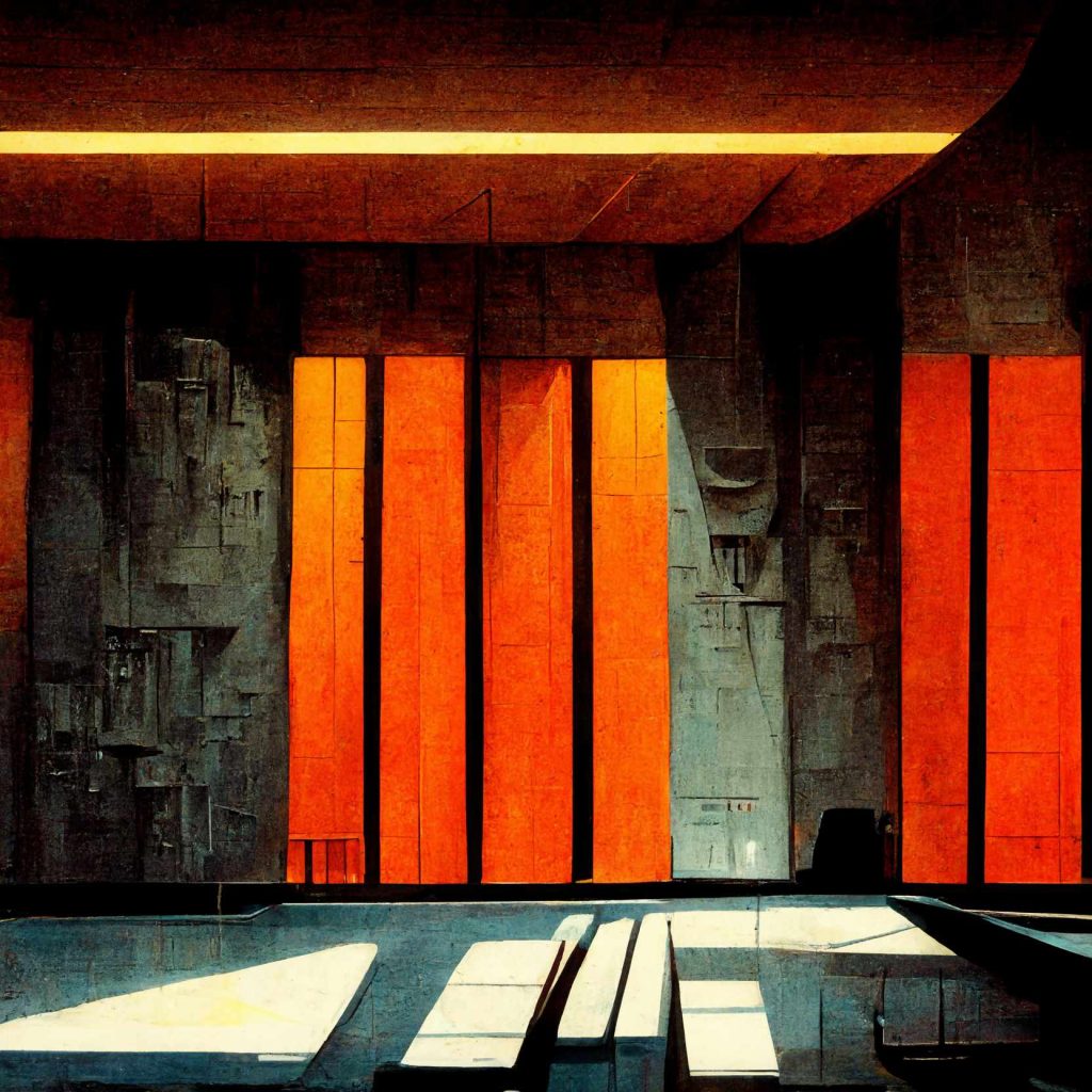
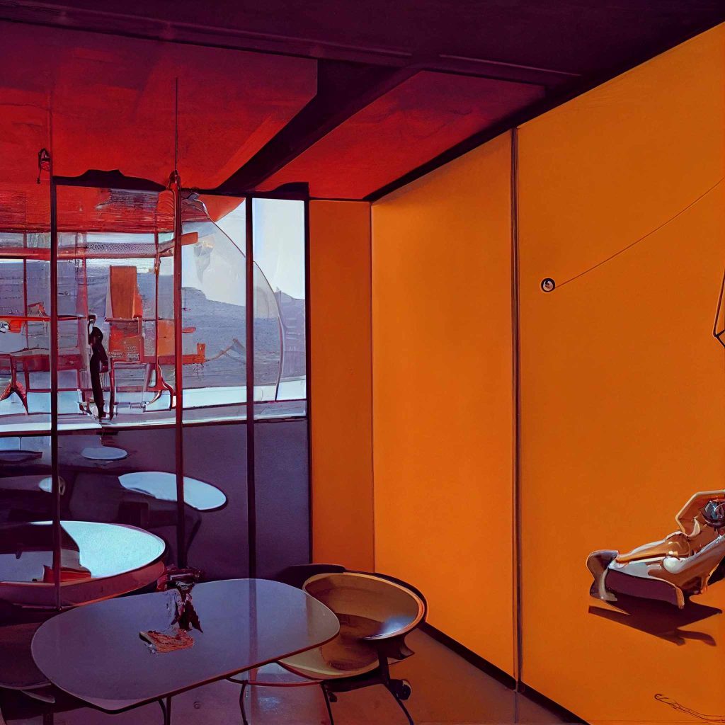
Commissioned as an early vision for a large-scale development in Armenia, Ervandashat imagines a year-round territory combining living, agriculture, tourism, culture, entertainment and adventure.
BDB developed the programmes, architectural concepts and visual atmosphere for a family of unusual, transformable structures integrated with the landscape. The concepts were accepted as part of the architectural vision guiding the project’s subsequent development.
Role
Concept development · Programmes & architectural concepts · Mood & atmosphere direction

A question of order
I’ve seen perfectly good ideas disappear inside perfectly good design.
Nothing was particularly wrong. The typography was beautiful, the colors worked, everyone had approved the layout. All the ingredients were there, including a few that nobody remembered ordering.
And yet, somehow, the important thing had gone missing.
It’s remarkable how much effort can go into making something look right before anyone asks whether it’s saying the right thing.
I suppose that’s why I’ve always been more interested in the relationships between things than in the things themselves. What deserves attention, what should remain in the background, and what happens when you give a minor detail the leading role.
Over time, this way of working acquired a more deliberate structure. I call it the Form & Structure Method, or FSM.
It begins with Structure — understanding what we’re dealing with, how the pieces relate to one another, and which of them actually matter.
Then comes Form, where those relationships become something we can see and experience. This is where design gets interesting, and occasionally rather difficult, because a beautiful composition can be remarkably persuasive even when it’s telling the wrong story.
And then there’s Alignment. The part where we return to our original intentions and find out whether the result has remained faithful to them.
Sometimes it has. Sometimes the design has developed ideas of its own.
I don’t necessarily object to that. But I’d rather know.
Structure → Form → Alignment.
Three steps. They look reassuringly simple written down like that.
Which is nice.
The projects themselves are rarely so considerate.
SELECTED
WORK / 03
GreenInvest
Brand Identity / Creative Direction
From agricultural perception
to a managed investment system.
Perception shift
From nature and agriculture to the architecture of a managed asset.
Context
GreenInvest works with agricultural land, but the project is not a farm brand. It is a repeatable investment system built on management, structure and long-term growth. Its earlier visual language communicated nature more clearly than control.
BDB decision
BDB preserved the land as the material foundation and made the management system visible. Surface, geometry, scheme and architecture became four layers of one visual language.
System evidence
Surface — the physical reality of land and orchards.
Geometry — the organisation and rhythm of cultivation.
Scheme — coordinates, markers and control points.
Architecture — the complete system of managed growth.
Role
Concept direction · Identity system · Communication architecture
How much trouble are we talking about?
People come to a design studio with very different ideas of what needs to be done.
Some have a business that has outgrown its identity. Others are starting something new and would rather not spend the next five years explaining what it is. Occasionally, someone arrives with a website that has been redesigned twice and is now, rather impressively, worse than the original.
There are also projects that don’t fit comfortably into any of the usual categories. An exhibition, a temporary environment, a public experience, or an idea that needs to exist somewhere beyond a presentation.
I rather like those.
The size of the assignment rarely tells you much about the amount of thinking involved. A small change can demand an extraordinary amount of consideration, while an entire visual system may come together once the right relationships have been established.
Of course, explaining this to someone who just wants a new logo can make for an interesting first meeting.
But I don’t believe every project needs a grand transformation.
But if you’ve got the budget… why not?
Well, here we are.
I suppose I should finish with something inspiring about creativity, ambition, and the extraordinary things we could achieve together.
There are people who are very good at that sort of thing.
I’m better at having a conversation.
You might have a project in mind. You might have something that’s been bothering you about an existing one. Or perhaps you’ve seen something here that made you curious.
That’s a perfectly good place to start.
I can’t promise we’ll agree on everything. In fact, I’d be a little concerned if we did.
But we can talk.
And if nothing comes of it, at least we’ll have met.